Works
No. 121 Sword of Flames OVA Arrange


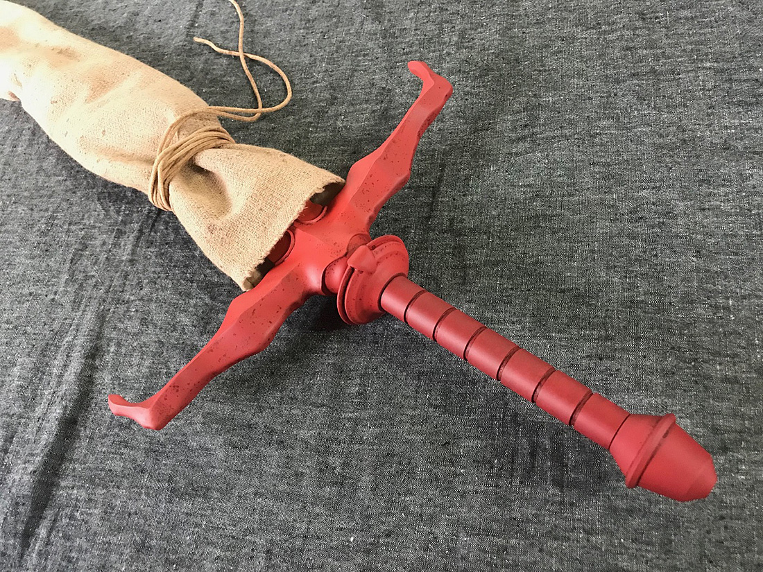
From: BASTARD!!
Character: Dark Schneider
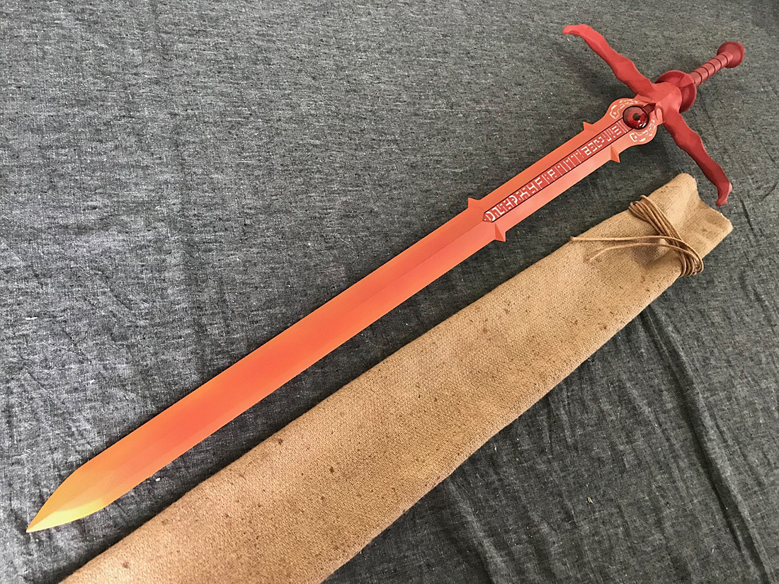
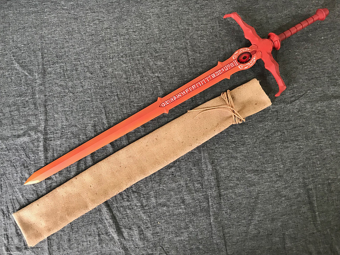
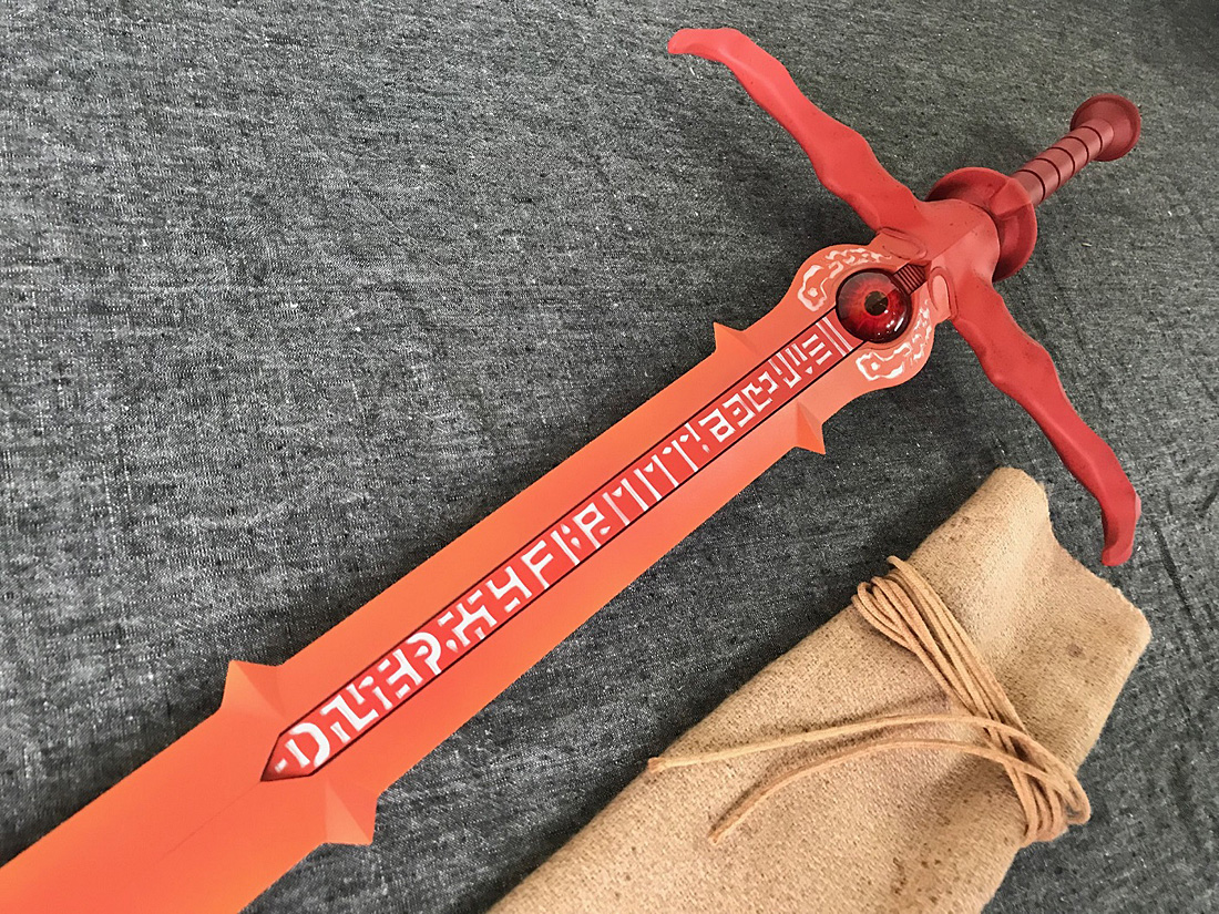
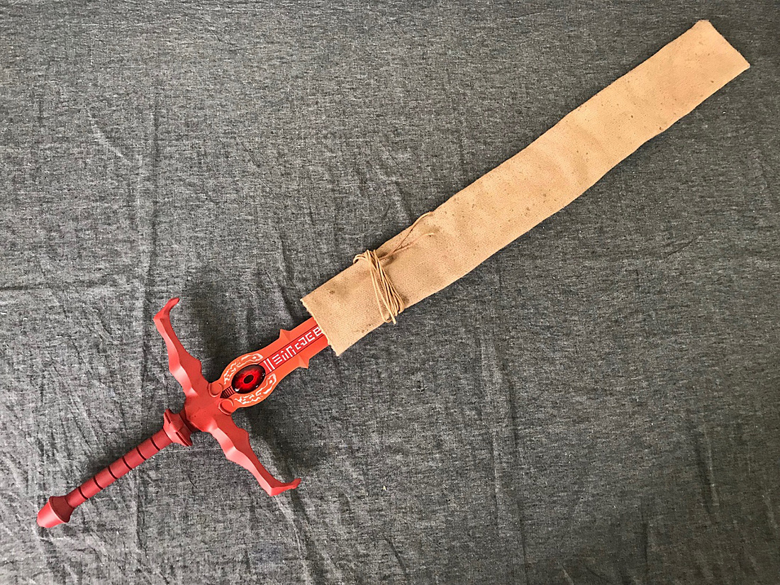
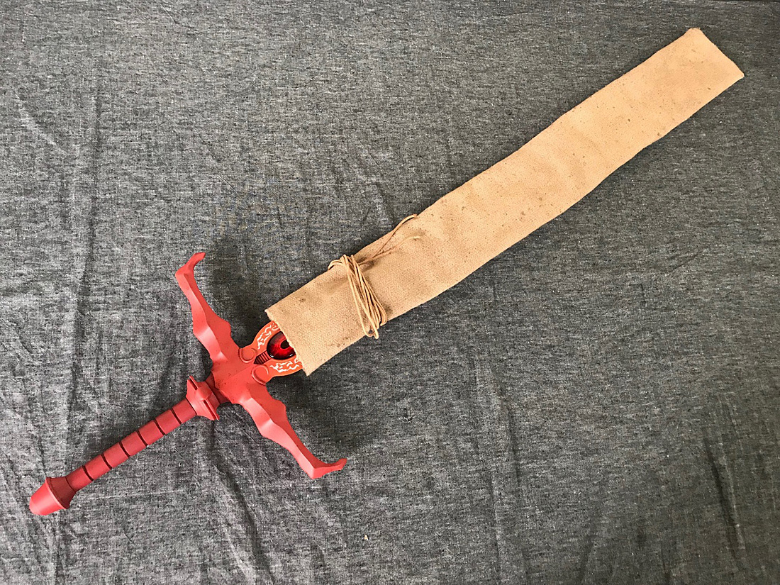
This time we tried to get the replicate the image of the mana flowing out of the sword.
Originally we were considering something closer to the original manga, but while we were discussing colours, we decided to go with an arrange with the OVA version.
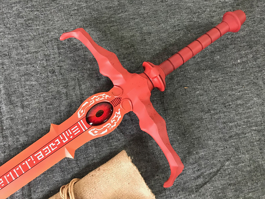
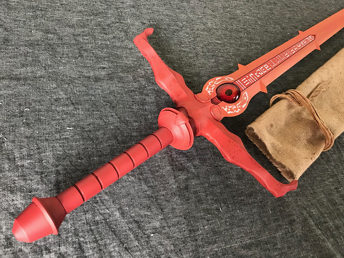
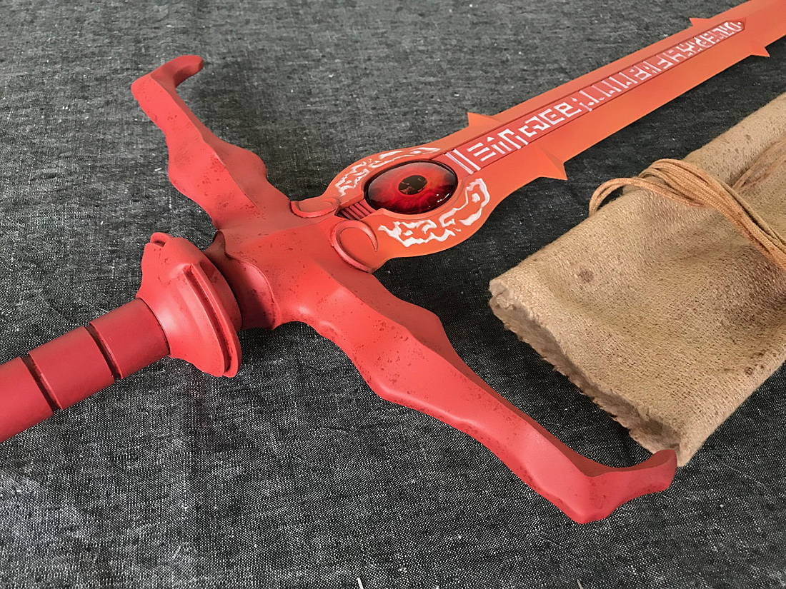
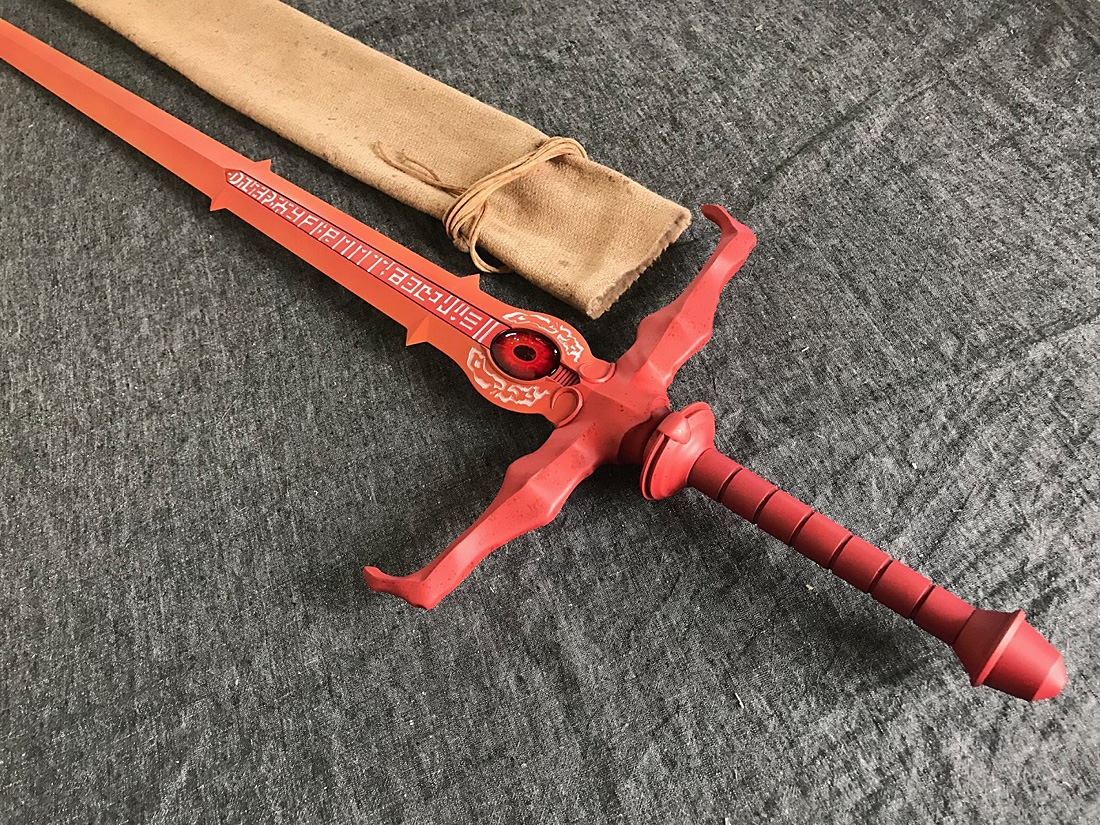
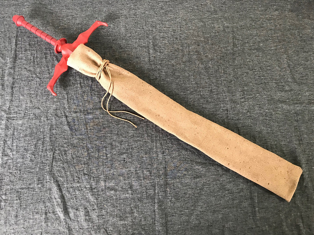
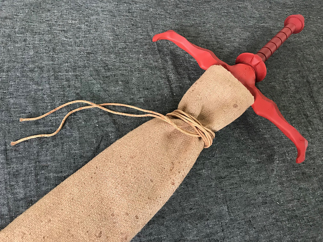
- In order to enhance the roughness we made the guard larger
- In order to be able to grip the sword with both hands, we extended the grip slightly and gave it a slightly greater volume
- The grip design is not the wound leather tape design, but rather the cut disc design from the OVA
- We gave it a flaming image by giving it a gradation getting lighter towards the point
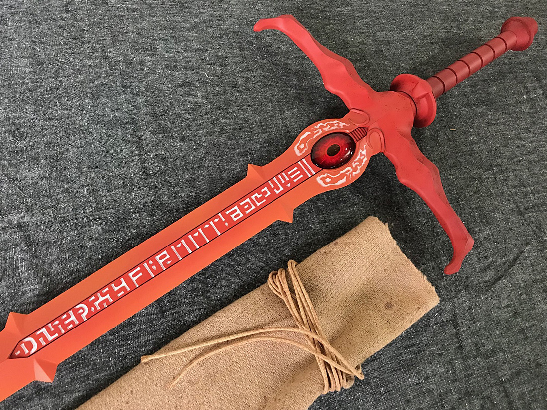
- The font around the jewel and blades were bezelled thicker
- A glyph design was added around the jewel
- The blade plate font was a magical looking design
- The jewel was a dark red spreading out to orange and yellow, based on the eclipse design from Yfreet's Eyes
- The cloth bag was aged and damaged to replicate the look and feel of the world
- We aged it less towards the guard from the grip.
When we got the order I had to pull out the old manga from my bookshelf, and caught myself reading too much of it too many times!
The biggest difficulty this time was the coloring. It's a flame sword so I was thinking of a red-based color design, but I couldn't find any artwork to aid my designs.
After a fair bit of research,
I noticed the OVA existed and used that as a base for our designs when working with the client.
Also, we were stuck on whether to darken the fonts right to the very end.
In the end we used a gradation to make it look like it was hot, and we made the font lighter to fit that image.
Working on this took me back to the days when I used to be excited for every new chapter every week.
Thank you for the order!
We're waiting on your next order.
Blacksmith G
| Length | 120cm | Width | 34cm |
| Thickness | 6,5cm | Weight | 1,500g |
Sizes and weights are approximate.
~Comments from the Customer: Satou-san~
Thanks to you guys I'm able to own a cursed sword now.
Both the texture and volume is just great.
It just feels like the real thing. To me it may as well be the real thing.
I know I'm not supposed to swing it about,
but before I realised, I was having a bit of fun with it. I'm glad I became an adult.
Thank you for the model. Once I've had a bit more fun with this I'm thinking of asking for another model.
Personally I'd like the Dai's sword, but looking at this I'm wondering if the Garian sword is also doable.
I look forward to ordering from you again.